Four ways of visualizing free-form survey responses
Free-form text responses in surveys are a gold mine of information. Unlike close-ended survey questions, they can be used to spot unexpected narratives and issues that would otherwise have been missed. Instead of asking respondents to choose between a number of preconceived options, open questions allow them to tell their own stories – and for larger narratives to emerge from these individual stories.
This post describes four ways of visualizing the content of free-form text responses:
- Contextual word cloud
- Semantic text landscape
- Topic table
- Topic foam chart
To illustrate each method, we use a public dataset, Community Survey Open-ended Comments (2016 & 2017) conducted by the City of Austin (available as a practice dataset in Dcipher Analytics trial accounts). Respondents have answered the question “If there was ONE thing you could share with the Mayor regarding the City of Austin (any comment, suggestion, etc.), what would it be?”
The question is: what are the respondents saying? Below we look at four ways of finding out. For a more detailed tutorial see this blog post or this tutorial in our Help Center.
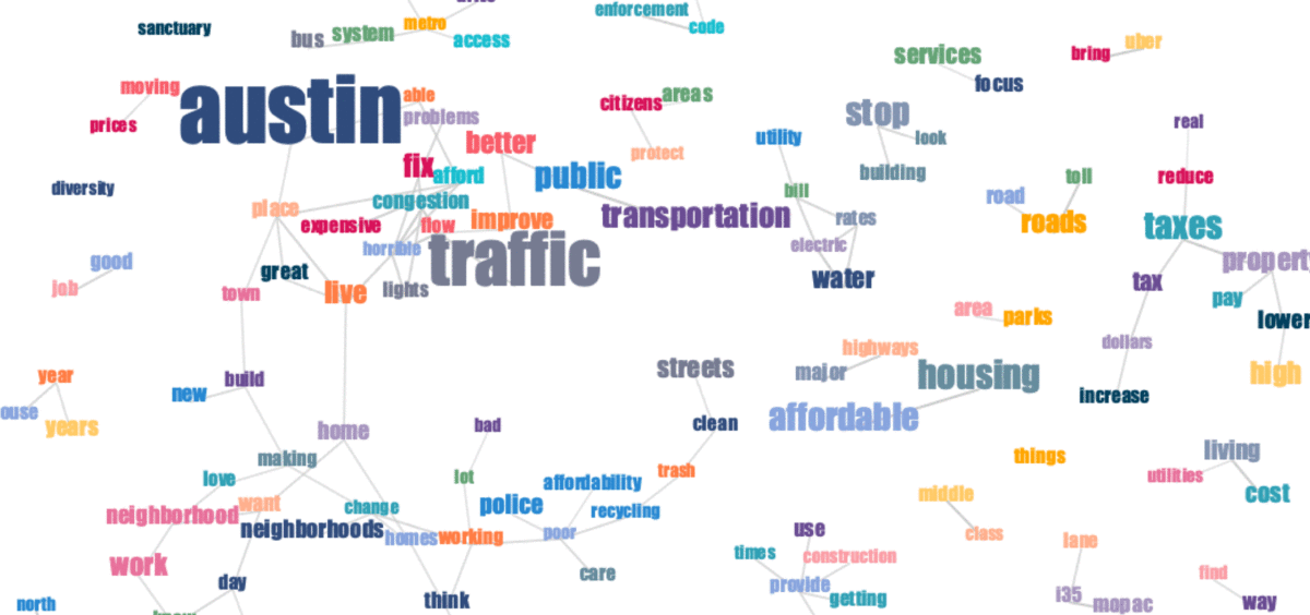
1. Contextual word cloud
While traditional word clouds only show how many times each word has appeared (word size), contextual word clouds also provide information about the context in which the words appear. Looking at a contextual word cloud, we get an understanding of how words are used together in the same responses.
Word size represents the number of responses a word appeared in. The links between words signify a contextual connection between the words, i.e. that they appeared in the same or similar responses.
This is how a contextual word cloud is created in Dcipher Analytics:
For more information about how to create and work with a contextual word cloud, see our Help Center article on the subject.
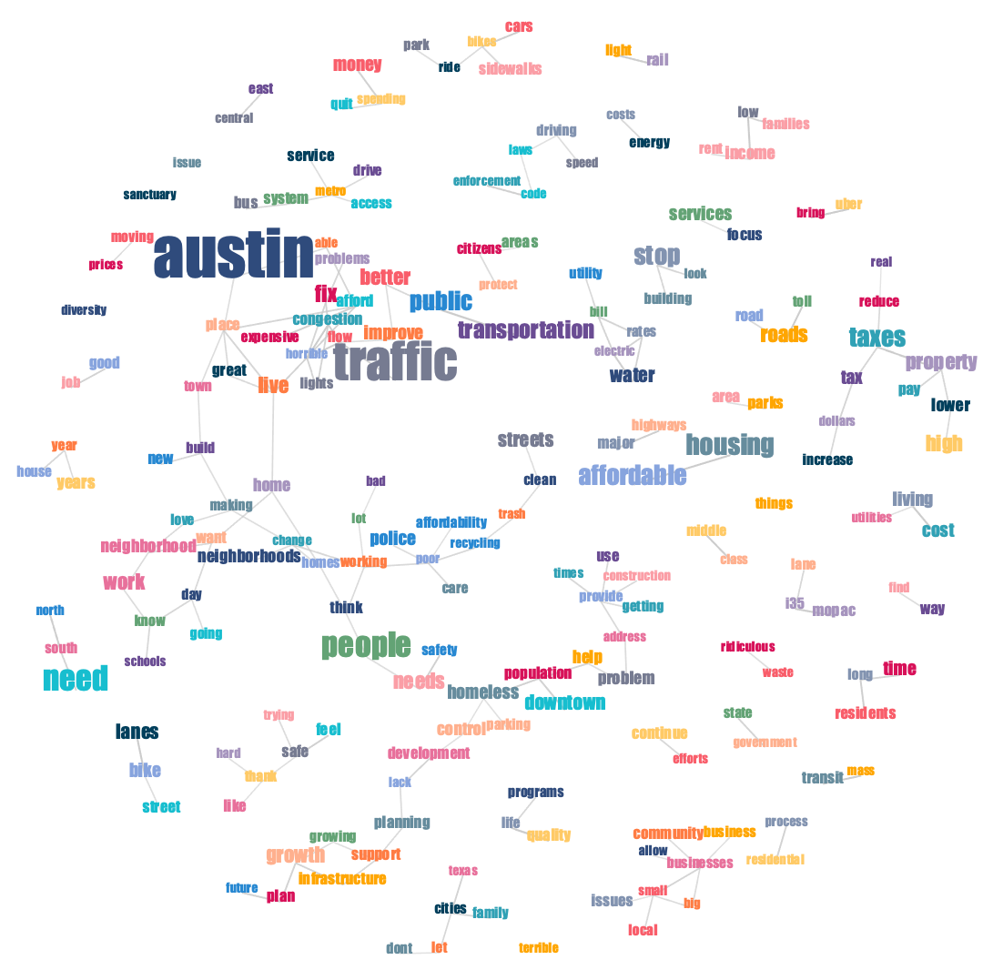
2. Semantic text landscape
In a semantic text landscape, responses are clustered together based on their semantic similarity. For example, consider the following responses:
- "Keep Austin environmentally healthy"
- "Conservation of water and provide green space"
The two responses are similar, despite not containing any of the same keywords. The result of similar responses clustering together is a landscape with dense areas (forming hills) and sparse areas (forming valleys). The hills in the landscape represent recurring themes in the survey responses.

The names of the hills are not automatically generated, but come from manual interpretation. In Dcipher Analytics, this is done by hovering over individual dots to read the related response and dragging a contour to the word cloud view to see the words associated with a cluster.
This is what the whole process looks like in Dcipher:
For those interested in the technical details, here is how the landscape is formed: each response is vectorized using a transformer model. The responses are then projected from the original, high-dimensional space onto two dimensions in a way that seeks to maintain the higher-dimensional structures as well as possible. The horizontal and vertical axes are the result of this process and do not have any other concrete meaning (though they sometimes end up capturing some meaningful dimensions in the texts). For more information, read our document landscaping tutorial.
A model is trained from the data, so the method works best for larger datasets (at least 1000 responses are preferable). For smaller datasets, we recommend using a pre-trained model.
3. Topic table
While semantic text landscapes provide a visual overview of the responses, some nuances are lost when projecting complex semantic structures down to only two dimensions. Semantic topic detection operates in higher-dimensional space and is therefore able to capture more specific topics. It searchers for semantic clusters and then identifies the words associated with each cluster. Interpreting the clusters is fast, because clarifying information, such as representative responses, can be displayed alongside the topics. Additional supporting information, such as average sentiment score, can also be displayed in the table.

The topic names need to be interpreted from the data. In the current example, the keywords and representative responses help us quickly interpret and name the top three topics:
- Improve public transportation
- Fix traffic problems and congestion
- Do something about the high cost of utilities
In Dcipher, follow the steps in the video below to detect topics and generate supporting information.
For more information about semantic topic modeling, see this Help Center article.
4. Topic foam chart
A more visual way of displaying topics is in the form of a foam charts:
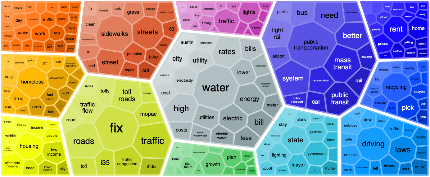
Each group represents a topic and each cell represents a word associated with the topic. The sizes of the topics reflect the number of associated responses while the sizes of the words show how strongly the words are connected to their topics.
The video below assumes that you followed Step 3 above and thus already detected topics in your free-form text responses.
Get started!
To access our text analytics toolbox and try out analyzing free-form text responses in Dcipher Analytics, sign up for a free trial.